

torsdag 18 december 2008
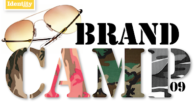
Identity Brand Camp 09
Vi på Identity Works har fått den stora äran att leda varumärkeskursen på Berghs för Grafisk Design 2:orna. Och gissa om de ska få jobba. Och lära sig att bygga och skapa starka varumärken. Vi kickar igång direkt den 7 januari med en härligt lång dubbel lektion. Så jag passar på att önska våra blivande elever och alla andra en lugn och fin jul. För nästa år smäller det!
onsdag 3 december 2008
Is European innovation lagging behind?
We get the answer straight up: NO. But the guy’s speaking from Duke and Levi Strauss do see a lot of traditional ideas taken into new medias. Where they don’t necessarily work as well. Then onto the recession; where the consumer needs to feel confident in an overexposed world. So the strategy in a recession would be to under promise (the communication: deliver variety) and over deliver (the product: deliver comfort). That will create the strong loyalty needed in a recession market. They show some great cases: Using iPhone as a level (vattenpass) for Bosh! !
!
And Emotional cities, where buildings in the city are coloured by the mood of the inhibitors via a website. Then the Levi’s case: That shows how well retail and digital can go together: Branded entertainment creates a retail experience witch gives an added value service. That leads to an activity tool that enables a loyalty far beyond club card and collecting points. And finally a really interesting aspect at one of the seminars today. Who signs off (=pays for) the idea? And the notion that clients are not structured for digital innovation and creative visions as a whole. Also the clients need to be at the right level and need to evolve too. Suddenly I felt very lonely without some of my dear clients next to me. We need to do this work together and be on the same level. The speaker works at Levi’s and has in only one year moved the brand to higher levels. They talked about change management. An interesting term. The aspect is often forgotten. Clients need to be able to manage change in their organization. Specially when making a strategic move with the brand. So it’s time to define and support the client of the future!
 !
!And Emotional cities, where buildings in the city are coloured by the mood of the inhibitors via a website. Then the Levi’s case: That shows how well retail and digital can go together: Branded entertainment creates a retail experience witch gives an added value service. That leads to an activity tool that enables a loyalty far beyond club card and collecting points. And finally a really interesting aspect at one of the seminars today. Who signs off (=pays for) the idea? And the notion that clients are not structured for digital innovation and creative visions as a whole. Also the clients need to be at the right level and need to evolve too. Suddenly I felt very lonely without some of my dear clients next to me. We need to do this work together and be on the same level. The speaker works at Levi’s and has in only one year moved the brand to higher levels. They talked about change management. An interesting term. The aspect is often forgotten. Clients need to be able to manage change in their organization. Specially when making a strategic move with the brand. So it’s time to define and support the client of the future!
Droga5
See the interview with David Droga just after his seminar on-line: http://mingeltv.eurobest.com/videos/details/48 (I couldn’t make it to the seminar. Had to take my son to the dentist. All those priorities in life!) (Catarina: did you go?)


tisdag 2 december 2008
No wore walls
Julian Wade from 180 Amsterdam made a very good seminar today at Eurobest in Stockholm, Berns. He starts with the Bauhaus manifest: Form follows function. And talks about how relevant that still is today. Here are some of his sayings:
- We need to start to think outside the boxes we put ourselves in. (i.e. I’m a designer then my ideas are design ideas. And instead mix creative specialists and do things together).
- A world so fragmented with visual noise need the Brand Identity to drive a pure signal. This is now more vital than ever.
- The big ideas is a given. But the boxes and walls are not.
- Today it’s about creating and building a brand, not just selling a brand.
Then some great cases:
Adidas: Impossible is noting: The art by athletes project. The idea was to make superstars human by letting them draw and paint and then make animations, art books and web sites around their art. Beautiful and goose bumpy concept.
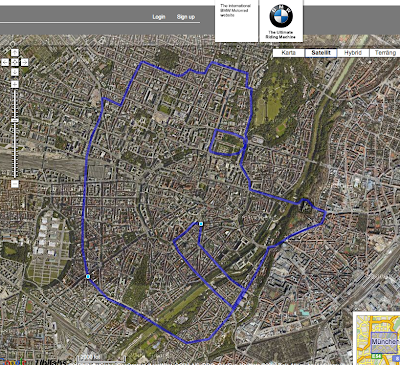
BMW: To put the motorcycle brand to a younger audience. He continues: What if we think less in terms of a brand identity and more in terms of a fluid brand personality. A more spiritual appearance. And the created the Unstoppable concept. A totally mind-blowing interactive idea when people on bikes have created drawings via the GPS track by racing around a city. Amazing. Especially for a map-loving person like myself!
See the interview with him after the seminar: http://mingeltv.eurobest.com/videos/details/38
Love his last words about that all that are nominees are winners = us at Identity Works!!
- We need to start to think outside the boxes we put ourselves in. (i.e. I’m a designer then my ideas are design ideas. And instead mix creative specialists and do things together).
- A world so fragmented with visual noise need the Brand Identity to drive a pure signal. This is now more vital than ever.
- The big ideas is a given. But the boxes and walls are not.
- Today it’s about creating and building a brand, not just selling a brand.
Then some great cases:
Adidas: Impossible is noting: The art by athletes project. The idea was to make superstars human by letting them draw and paint and then make animations, art books and web sites around their art. Beautiful and goose bumpy concept.
BMW: To put the motorcycle brand to a younger audience. He continues: What if we think less in terms of a brand identity and more in terms of a fluid brand personality. A more spiritual appearance. And the created the Unstoppable concept. A totally mind-blowing interactive idea when people on bikes have created drawings via the GPS track by racing around a city. Amazing. Especially for a map-loving person like myself!
See the interview with him after the seminar: http://mingeltv.eurobest.com/videos/details/38
Love his last words about that all that are nominees are winners = us at Identity Works!!

måndag 1 december 2008
Eurobest in Stockholm!
Today I'm skipping between seminars and workmeetings. And there're a lot of interesting things going on at Berns. And we're nominated in the Design category! Åbro Lion with tatoo illustration and all. Yes! Enjoy some footage from inside:
onsdag 26 november 2008
Så många stjärnor som tänds!
Givehope.se är fantastiskt. Att se så många människor mer eller mindre kopplade till varandra göra gemensam sak och startar något, säger något eller tar ställning för något. I detta fallet är det kampen mot barncancer. Ett stjärnsystem skapas.
Det är en samverkan. Ensam är ingen stark. En människa inspirerar en annan och se, det blev något mer.
Eller ta alla dessa fantastiska människor som varit med och skapat give hope. Johan, Jonas, Tomas, Monica, Kaj, Carl, Leo, Sofi, Danne, Åsa. Eller Olle och Anne, som varit med och caterat och sagt ja. Har jag glömt någon, är någon med som inte bidragit så mycket? Ja säkert. Vem får äran för allt? En idé som utan skickliga webbkreatörer eller designers aldrig hade blivit av. Äran till teamet? Äran till individen?
Läs mer på walters blogg
och tyck till. Walter, en duktig idé- och konceptutvecklare, en stjärna som har tänts.
Voilà. Eller läs artikeln på Resumé och avgör. Vem får äran?
fredag 21 november 2008
torsdag 20 november 2008

onsdag 12 november 2008
Give while giving!

Finally, we are at the launch of one our most emotional, exhausting, enthousiastic and time consuming projects. You'll read more about it in tomorrows papers.
Today I am blogging about it out of a personal perspective. How important it is for me and many of me colleagues to be able to sometimes put our blood, sweat and tears into something that might might change the world a bit. I think we need to feel that altruistic feeling, that we contribute to something bigger than our own ego. It gives us pride and meaning. I have been following our team here at Identity and SuperStrikers. Now they work around the clock in order to be ready by Tuesday. I am so proud of what they have created. I bow my head.
onsdag 29 oktober 2008
The aesthetical Do's of Halloween
It's Halloween!!
Being a crazy American, Halloween is really engrained into my being. I was raised in the tradition of dressing up in horrifying costumes every year and trick-or-treating around the neighborhood of central Ohio. Being a horror film lover and enjoying the creepy feeling of being frightened senseless, this was one of the absolute best days of the year. Back then, we could actually trick-or-treat at night when it was pitch black outside, and I can't imagine it any other way (today, the fun ends when it becomes dark). As a matter of fact, I was so affected by the planning and suspense of halloween that I dream about trick-or-treating about once a month! (Just call me a nerd.)
Every year I dumped my enormous bag of candy on the living room floor and analysed all of the varieties, grouping them into categories of best brands and worse/no-name brands (these were the ones that mom got if she asked for me to share with her ; ). Of course one remembers the house that generously gives out the best bars, and blacklists the homes that dared to give you the cheapest of the cheap, without chocolate contents and without a proper wrapper that invested in appropriate Halloween attire. This was very important to complete the ring of scary experiences!
Yes, in the United States basically every edible, sweet brand re-clothes its packaging during this time of year. Of course you expect American confectionary brands to go the halloween route, but did you know that even crackers, ice cream, potato chips, cereals, and beverages also make the spooky change?
From a European design and branding standpoint, the thought of a Halloween-themed attire probably sounds very tacky and tasteless. But I, American, really wanted to dig a bit deeper in this area. Are there tasteful AND non-tacky applications for this holiday? The answer is...NO! One of the two parameters seems to be a requisite. But, hey, with Halloween comes the possibility to explore your tacky inner self, to break away from the clean and streamlined sophistication we try to surround ourselves with daily. Let yourself go!
With that, let me present my few findings. First up are my 4 best packaging finds, before moving on to 4 best product finds.
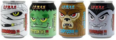
Halloween packaging aesthetic #1: Jones Soda - A creepy treat by the folks at Jones
I adore these cans of soda! Humorous design and fun flavour names like Buried Pomegranate, Lemon Drop Dead, Spooookiwi, Candy Corn, Blood Orange and Dread Apple) make me howl!
www.jonessoda.com
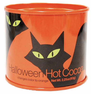
Halloween packaging aesthetic #2: Crate & Barrel Halloween cocoa
Crate & Barrel's attractive can with two servings of cocoa powder mystically turns orange when mixing with milk. This is on my aesthetic list, although not a huge ball of fun.
www.crateandbarrel.com/family
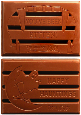
 Halloween packaging aesthetic #3: Kit Kat Ghoulish Collection
This is a finely executed package for a major brand which changes disguise in the good spirit of halloween. I love the vampire sinking his teeth around the logotype (he seems to be biting very gently, as if holding a delicate egg in his mouth, in respect of the Kit Kat brand's free space!), as well as the relatively clean look. Kit Kat is one of the bars that I sorted into the 'best' pile when I was young, but with text and images now on the chocolate bar itself, Kit Kat's trick-or-treat version ends up in a brand-name category by itself.

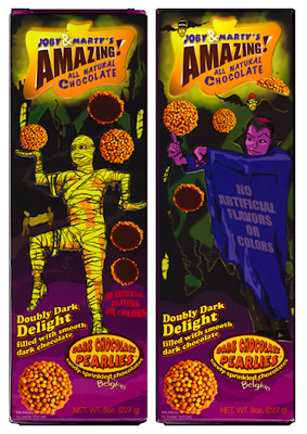
 Halloween packaging aesthetic #4: Joby & Marty's Amazing All Natural Chocolate
Talk about kitch! Joby & Marty's is a leader in kitchy (read: tacky) holiday-inspired packages that just wanna have fun. With this bar in hand, you may just as well admit that you believe in UFOs and dream of quitting your job to run a comic book store.
www.jobyandmartys.com
 Is it worth the investment for a new halloween package design, production, and distribution for such a short timeframe? When it comes to major candy brands in the US, kids will never forget the brands that made the effort to impress them with their halloween humor. And with halloween being the leading candy holiday (with sales of $2.1 billion dollars in 2005, according to Bankrate.com, http://www.bankrate.com/brm/news/biz/thumb/20011024a.asp), that memory will turn out to be very important during an individual's lifetime.
Now let's take a step away from packaging. Being a halloween fanatic who has served jello formed in a brain mold to my guests, I was just 'dying' to find if there were any non-food spooky products that could be considered aesthetic. Here are my four best:
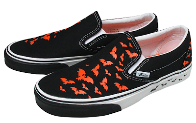
Halloween product aesthetic #1: Vans 'Bat Trails'
The classic slip-on has never been afraid of expressing its feelings. Here in a new halloween design called 'Bat Trails'.
www.shop.vans.com
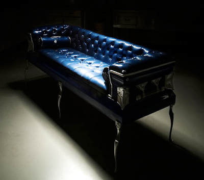
 Halloween product aesthetic #2: Coffin Couches' eco-friendly coffin sofa
We at Identity Works stand for eco-friendly products....and here we have a truly unusual peice! The company Coffin Couches produces sofas made of recycled coffins. The coffins have been used once for showings and may have had minor nicks in the finish, but have never been underground, obviously! Rather than letting the costly and luxurious boxes end up in a landfill, the company came up with the idea of making furniture. Gotta love it!
http://coffincouches.com/
Halloween product aesthetic #3: Marc Jacobs Sidney timepiece
It's true, Marc Jacobs stands behind this watch, perfect for this time of year.
Sidney # MBM 5016
www.marcjacobs.com
 Halloween product aesthetic #4: Skeleton hand salad spoons
These boney utensils help you 'sink your teeth into' a good salad.
www.whatonearthcatalog.com

Please don't hesitate if you are able to challenge these packaging or product best-ofs! And don't forget, the frightful day comes and goes quickly, so enjoy it while you can, kids!
Article by Gail Baker
Being a crazy American, Halloween is really engrained into my being. I was raised in the tradition of dressing up in horrifying costumes every year and trick-or-treating around the neighborhood of central Ohio. Being a horror film lover and enjoying the creepy feeling of being frightened senseless, this was one of the absolute best days of the year. Back then, we could actually trick-or-treat at night when it was pitch black outside, and I can't imagine it any other way (today, the fun ends when it becomes dark). As a matter of fact, I was so affected by the planning and suspense of halloween that I dream about trick-or-treating about once a month! (Just call me a nerd.)
Every year I dumped my enormous bag of candy on the living room floor and analysed all of the varieties, grouping them into categories of best brands and worse/no-name brands (these were the ones that mom got if she asked for me to share with her ; ). Of course one remembers the house that generously gives out the best bars, and blacklists the homes that dared to give you the cheapest of the cheap, without chocolate contents and without a proper wrapper that invested in appropriate Halloween attire. This was very important to complete the ring of scary experiences!
Yes, in the United States basically every edible, sweet brand re-clothes its packaging during this time of year. Of course you expect American confectionary brands to go the halloween route, but did you know that even crackers, ice cream, potato chips, cereals, and beverages also make the spooky change?
From a European design and branding standpoint, the thought of a Halloween-themed attire probably sounds very tacky and tasteless. But I, American, really wanted to dig a bit deeper in this area. Are there tasteful AND non-tacky applications for this holiday? The answer is...NO! One of the two parameters seems to be a requisite. But, hey, with Halloween comes the possibility to explore your tacky inner self, to break away from the clean and streamlined sophistication we try to surround ourselves with daily. Let yourself go!
With that, let me present my few findings. First up are my 4 best packaging finds, before moving on to 4 best product finds.
Halloween packaging aesthetic #1: Jones Soda - A creepy treat by the folks at Jones
I adore these cans of soda! Humorous design and fun flavour names like Buried Pomegranate, Lemon Drop Dead, Spooookiwi, Candy Corn, Blood Orange and Dread Apple) make me howl!
www.jonessoda.com

Halloween packaging aesthetic #2: Crate & Barrel Halloween cocoa
Crate & Barrel's attractive can with two servings of cocoa powder mystically turns orange when mixing with milk. This is on my aesthetic list, although not a huge ball of fun.
www.crateandbarrel.com/family
 Halloween packaging aesthetic #3: Kit Kat Ghoulish Collection
This is a finely executed package for a major brand which changes disguise in the good spirit of halloween. I love the vampire sinking his teeth around the logotype (he seems to be biting very gently, as if holding a delicate egg in his mouth, in respect of the Kit Kat brand's free space!), as well as the relatively clean look. Kit Kat is one of the bars that I sorted into the 'best' pile when I was young, but with text and images now on the chocolate bar itself, Kit Kat's trick-or-treat version ends up in a brand-name category by itself.

 Halloween packaging aesthetic #4: Joby & Marty's Amazing All Natural Chocolate
Talk about kitch! Joby & Marty's is a leader in kitchy (read: tacky) holiday-inspired packages that just wanna have fun. With this bar in hand, you may just as well admit that you believe in UFOs and dream of quitting your job to run a comic book store.
www.jobyandmartys.com
 Is it worth the investment for a new halloween package design, production, and distribution for such a short timeframe? When it comes to major candy brands in the US, kids will never forget the brands that made the effort to impress them with their halloween humor. And with halloween being the leading candy holiday (with sales of $2.1 billion dollars in 2005, according to Bankrate.com, http://www.bankrate.com/brm/news/biz/thumb/20011024a.asp), that memory will turn out to be very important during an individual's lifetime.
Now let's take a step away from packaging. Being a halloween fanatic who has served jello formed in a brain mold to my guests, I was just 'dying' to find if there were any non-food spooky products that could be considered aesthetic. Here are my four best:
Halloween product aesthetic #1: Vans 'Bat Trails'
The classic slip-on has never been afraid of expressing its feelings. Here in a new halloween design called 'Bat Trails'.
www.shop.vans.com
 Halloween product aesthetic #2: Coffin Couches' eco-friendly coffin sofa
We at Identity Works stand for eco-friendly products....and here we have a truly unusual peice! The company Coffin Couches produces sofas made of recycled coffins. The coffins have been used once for showings and may have had minor nicks in the finish, but have never been underground, obviously! Rather than letting the costly and luxurious boxes end up in a landfill, the company came up with the idea of making furniture. Gotta love it!
http://coffincouches.com/

Halloween product aesthetic #3: Marc Jacobs Sidney timepiece
It's true, Marc Jacobs stands behind this watch, perfect for this time of year.
Sidney # MBM 5016
www.marcjacobs.com
 Halloween product aesthetic #4: Skeleton hand salad spoons
These boney utensils help you 'sink your teeth into' a good salad.
www.whatonearthcatalog.com

Please don't hesitate if you are able to challenge these packaging or product best-ofs! And don't forget, the frightful day comes and goes quickly, so enjoy it while you can, kids!
Article by Gail Baker
tisdag 21 oktober 2008
'Heading' for the best - the balance of form & function in a helmet
 Let's talk about amazing products which throw your expectations out the window and give you a new point in which to benchmark future products. Yes, we are talking about a helmet! And if you never thought about or wanted a helmet before, now you will. Ruby (Les Ateliers Ruby) based in France, declares itself as 'the leading brand for exceptional accessories committed to keeping you on the move', a product for 'everyday heros and heroines.' And let us just say that the letters in the word EXCEPTIONAL should definitely be uppercase. Ruby creates the Rolls-Royce of helmets, with high craftsmanship down to every luxurious detail, from the nappa lambskin lining to the gorgeous ruby red packaging. All I can say is, 'fantastic!'
The company was initially formed by Jerome Coste, who combined his passion for skateboarding and motorcycling with his interest in digging deeper into brand identity. With additional influences such as Steve McQueen and science fiction, the combination makes for a product clearly placed on the peak of Identity Works brand pyramid, where there is just no substitute for the product (contact us if you would like more information about the brand pyramid and how to make it to the top). With a motivation of making uncompromising choices because life is just too precious (due to Coste's own life experiences through his daredevil sporting days), it is clear that Ruby has succeeded in combining form and function in a superior way.


 To attract the collector and connoisseur (for those who want something even more than a perfect balance of form and function from the base assortment), a limited edition series will be interpreted by artists , and the first one out is by HNT (Honet), a former Parisian graffiti artist and current graphic artist who has taken his personal style and translated it into a playful and contemporary helmet that I would love to have on my shelf in the living room just as much (or more) as on my head!
 The dealer in Sweden is Grand Pa (Södermannagatan 21), otherwise you can check out the collection at numerous locations when in California or New York.
Links:
Ruby: www.ateliersruby.com
Honet: www.monsieurlagent.com/works.php
(Note: Ruby images are from the Ruby website above)
Article by Gail Baker
torsdag 9 oktober 2008
Kommersiell design - guldvinnare!
Vad skönt, att utpräglad kommersiell design ämnad till den breda massan och mångas smak kan vinna Svenska Designpriset. Kan behövas i denna redan uttjatade lågkonjunktur. ICA I love Eco bidrar till att hela ICAs ekologiska ökar med 70% jämfört med 2007 på halvårsbasis, schysst ROI.
För övrigt, bidragen utställda igår på Moderna var i klass med Cannes och däröver. Se dem när de åker ut på turné Stockholm, Göteborg och Malmö. Kände mig dubbelt stolt att svensk design håller hög klass.
För övrigt, bidragen utställda igår på Moderna var i klass med Cannes och däröver. Se dem när de åker ut på turné Stockholm, Göteborg och Malmö. Kände mig dubbelt stolt att svensk design håller hög klass.
söndag 21 september 2008
Broadcast your Identity & Do good as you do well

Rob Walker, columnist at New York Times recently published this book, Buying in.
It's about how we conciously or unconciously define who we are in what we buy. I'd say we do it conciously. Today, we want to broadcast our identity as much as we want to talk about ourselves. And, of course you want to buy something in which you believe in. You also want to show the world who you are in relating yourself to a specific brand with a specific story. There are of course other ways in showing who you are. For example Mr Damien Hirst who skipped the Art Gallery and went to the auction and got 1, something billions for one of his work and 2 days later posted a checque of 10 millions of something to a Shelter in London. Talking about broadcasting your identity and doing good as you are doing well.
fredag 19 september 2008
Babies to Consumers

I gave birth to a little son two weeks ago, and with work still relatively fresh in my mind, I am already beginning to wonder about how my child will be affected by products and marketing early on. I guess these thoughts, although probably a bit premature, are better than sitting around watching Oprah all day during my maternity leave!
Today, companies are targeting children as well as young adults who still have positive childhood memories lingering. It isn't hard to find major marks on toys where we adults would not have expected them when we were children. When I was young, I wanted everything to be free from all graphics, markings and names. Our moms perhaps picked out and bought items for us, and we may not have thought that so bizarre. Does this option even exist any longer?
Today's kids are born into a world totally bombarded with messages. The statistic of how many choices we are forced to make per day is staggeringly high (and increasing by the minute). Every minute our brains take in massive amounts of information and we then make decisions- Am I interested? Is this worth another second of my time? Do I look twice? Delete? Save in short term memory? Long term memory? Because kids today are born into a much more intense world than we adults were, they are faster at making these decisions, however unaware he or she may be of this decision-making process.
Mom? Picking out something for the kids? Highly unlikely and probably unacceptable! Kids today know exactly what they want, and they don't want someone else doing their picking and choosing.
And of course, when generations grow up, smart companies know how to maximize the interest of the young adult through connection of positive childhood memories. Generation X'ers and Y'ers for instance, were targeted by Mazda through the connection to Transformers, the robot conversion toys which will soon celebrate its 25th anniversary. Mazda hoped to pick up on positive memories of this target market by tying in the toy with the car. See this link on YouTube:
http://www.youtube.com/watch?v=OGA17R6sU3A
Interested in reading more about this topic? There are numerous excellent books that can be purchased from Amazon.com. Here is one recommendation:
 Article by Gail Baker
måndag 15 september 2008
An Oasis of Good Communication
Oasis releases a new album, and street musicians in New York are the first to perform the songs off of it. Trained by Liam and Noel Gallagher of course.
I love this campaign. The Sjönell brothers at BBH New York engineered this thing, and it's just solid proof of their understanding for what makes people talk. I'll toss a coin into that hat! Bravo!
I love this campaign. The Sjönell brothers at BBH New York engineered this thing, and it's just solid proof of their understanding for what makes people talk. I'll toss a coin into that hat! Bravo!
torsdag 11 september 2008
Awesome Red Bull Idea, Lars Berghe, Murketing, And Alignvertising
Here's a not to shabby idea by Red Bull:
They sent out people all over the world to ask bartenders to "give me something you recommend". If the bartender gave them Vodka Redbull, the bartender recieved an extraordinary tip, namely an Apple Ipod.
Do you think that these incognito bartender charity workers got talked about? You betcha! The rumor spread like wildfire, and pretty soon Vodka Redbull's where handed out as the standard respons to the question in question.
Lars Berge writes about this and other Red Bull campaigns in his column in SvD, and makes a good analysis on the concept of branding as opposed to advertising. When someone says that youngsters are getting immune to advertising messages, Lars argues that we are instead more motivated than ever to involve ourselves with different brands, just not in the traditional forced way. He's backing up his argument by referring to Rob Walker's book "Buying In", where the phenomenon is called "murketing".
Personally I think that this is a very bad term. It's not about murketing or being sneaky, it's about getting people to identify. Let's call it something else. How about... alignvertising. In alignvertising we do cool/loveable/responsible/outrageous/funny stuff that people want to be a part of and have their personalities align with.
Still, this might be a book worth reading. I'll look into it and get back to you.
tisdag 9 september 2008
When the product speaks for itself!


Read about Aesops products and found out that I really like their philosophical touch to things. As well as their design and messages.
Philosophy has a similar range of products and company culture. Check out their Charity products.
But what I like the most is the names; Cinnamon bun, Belgian wafles, The frango mint diet, Coconut frosting. All for the shower!
söndag 7 september 2008
Swedish companies investing in design grow faster

Just wanted to push a bit for the most important report from SVID for the last 24 months - "Swedish companies about design 2008". To have it in English post SVID an e-mail. Yes, companies who use design as a strategic tool tend to grow faster and have higher rate of exports.
Take a look at one of these Swedish companies, Fagerhult.
torsdag 28 augusti 2008
The Beautiful Fashion Tale Magazine

I really like the new Fashion Tale Magazine. Beautiful photography, interesting models, superb fashion sense all around.
They also have the entire thing on the web for your browsing pleasure.
Beautiful work, and hats of to Creative Director Carl Wahlström and Art Director Hanna Hedman. (I capitalized their titles on purpose).
måndag 25 augusti 2008
Might As Well Have The Best
Besides the fact that I absolutely adore the legendary (and expensive) bags from Filson, they also have less than humble tagline. "Might As Well Have The Best". I kind of like it actually.

But it's also one of those taglines that you HAVE to back up in your product. Unless you really ARE the best, having a tagline like that is just counter-productive. After having owned a 266 "Sportsman's Bag" for a while know, I can promise you that it does live up to it's tagline.
 They also have an interesting piece of "proof" on their warranty slip.

Classic and interesting brand.
But it's also one of those taglines that you HAVE to back up in your product. Unless you really ARE the best, having a tagline like that is just counter-productive. After having owned a 266 "Sportsman's Bag" for a while know, I can promise you that it does live up to it's tagline.

Classic and interesting brand.
tisdag 19 augusti 2008
Chief Innovation Officer Anna Sävenstedt To Aftonbladet
Organization of creativity and innovation is one of my favorite topics. I haven't written about it much here, but I actually wrote my masters thesis on the subject for my M.Sc. in Media Technology back in 2003.
More advanced organizational principles and technological aids for innovation are rare in the media industry, at least in Sweden. It's not easy to get these things to work, so I really can't blame anybody, but still I believe there should be more attempts made. If successfully inlemented it could be massively profitable.
Today I found out that Aftonbladet are actually instituting an innovation officer to work on these things, with the ambition to activate the most innovation capacity from the entire organization. Her name is Agnes Sävenstedt, and interestingly enough, she also has an M.Sc. in Media Technology. I guess we just like innovation.
Anyway, it's an interesting move from Aftonbladet, who I think are big enough to make something like this work.
Read more about it here.
lördag 16 augusti 2008
Household Trash


Swedish designer Jantze Brogård Asshoff has dreamt up this amazing looking trash can. I WANT ONE FOR MY KITCHEN!
Unfortunately it's not in production yet, so keep your fingers crossed.
(Read more about it here).
måndag 11 augusti 2008
Cycle in Style With These Fine Helmets
So, you want to swoosh down the street in style, but you don't want to crack your skull open in case of a crash – what to do?
Well, the Danish (who else...) solved the problem. With protective helmets disguised as stylish hats, Yakkay might well be a smash hit in style-conscious communities across the globe. Just look at these beauties:

The Meaning Is The Message, Or Is It?
A few Swedish blogs (here they are 1, 2, 3) have spent some time discussing if advertising needs a message. I believe it was all sparked by this article by Paul Feldwick.
For those of you who can't read Swedish (don't worry, we're only 9 million people), I can just quickly recap the discussion: They are discussing whether advertising should have a message, must have a message (since message is equal to meaning), or shouldn't have a message but rather a topic to sparc discussion. (Sorry 1, 2, 3 for the simplification).
I'm not so sure about defining message as being the same thing as meaning. A message is the code being sent, while meaning is the interpretation of the code. And that interpretation is dependent on many factors. I do agree on, on the other hand, that there needs to be some sort of message from someone (not necessarily the advertiser) in order for someone on the recieving end to have something to interpret, and thus make meaning out of.
First of all I would like to say that meaning doesn't have to be rational. It never is entirely, and most of the time it's predominatly emotional. For the most part we interpret with our emotions and try to explain our interpretations rationally. And that I think is one of the main points of Mr Feldwick's. So messages are most of the time interpreted into meaning without us ever knowing.
So what about messages? That's a little more complicated. A message is carried from point A to point B (where B can be anything from one person to several million). But it can also be forwarded on to C, D, and onwards (C and D can also be huge numbers). The can be distorted along the way, and will almost certainly be interpreted differently. Rational messages will be easy to interpret rationally, but will a lot of times lead to less stimulating emotional responses. Emotional and irrational messages can, if they are good, create a much stronger emotional response, a much wider spread (B, C, D, and onwards), and be more effective in attaching emotional values to the brand. But they require more talent (or luck) to create and a lot of trust from the client (I can only imagine the initial client response to the Cadbury's gorilla).
So to answer the question if advertising needs a message, I would say yes. All communication does. But it doesn't have to be a rational message, and the sender may be aware that there are many possible interpretations. In that case it's similar to art or poetry really. And advertising agencies would never claim to be in the business of art or poetry (besides the thursday night art club). But "branded content" is the hottest thing there is right now. I see paradox here.
My conclusion then:
Don't assume that messages and meanings interpreted out of those messages have to be rational. Meanings never are anyway, and succesful messages rarely are. And that's why succesful advertising agencies need talent. Emotional and artistic talent.
torsdag 7 augusti 2008
Digital Design Is Still a Child
Humanity has been pretty good at graphic design for quite some time now (though we may have called it something else early on). The same goes for packaging design. Sure there have been plenty of innovations along the way such as the printing press, photography and modern day packaging technology, but still.
I guess you could say that interaction design was born at the same time as the first stick n' stone tools, but more systematic and advanced interaction design can perhaps be considered approximately as old as the industrial revolution.
Digital interaction design, meaning design for interacting with computers, is young. DID aimed at the general public, is really young. Born by Xerox Parc and Apple (and copied by Microsoft), the window-based interaction model still prevails.
But being this young, I think we've only seen the first beginnings of a huge market for digital design (including DID). The move towards digital media is natural and inevitable, and we're still stuck i a design world that is very static. We're moving towards a "one machine"-world, where we'll interact with data in different ways, not neccessarily web pages. RSS-readers is an early example of this.
The more basic question of how to interact with data through a "browser" is one that many are trying to answer. Not least the people of Mozilla labs. They have suggested a model for a future browser that looks like this (corny film, but you'll get the point):
Aurora (Part 1) from Adaptive Path on Vimeo.
Can you imagine your grandmother trying to work this interface? Neither can I. I think that they have made the classic mistake of being too complicated and too techy. But that might just be me.
But if you spot a good digital design agency with razor sharp DID-skills, give me a call. I want to buy some stock and get rich.
måndag 4 augusti 2008
Design Talks: Supercars of the late 60's
On my new little section "Design Talks" I'll look at some design case studies that interest me. First out is the supercars of the late 60's and early 70's. They are interesting for several reasons. The designs have sprung from technical innovations like the mid-engine layout, but are also politically inspired by the space age race to the moon. Lines are simple technical and clean resembling the architecture and interior design of the late 90's or perhaps modern day highly designed tools. Only, it's the other way around.
With the innovation of the mid-engine layout and with space age inspiration, the 60's gave birth to the first incarnation of the supercar. This concept would keep on evolving until mid 70's where the oil crisis and an economic downward spiral put an end to the futuristic supercar dreams.
Besides improving car handling, the mid-engine layout enabled designers to integrate the angle of the shorter bonnet with the windshield, effectively creating a bulletlike profile. The 1968 Alfa Romeo Carabo, designed by Marcello Gandini is a nice example.

It's incredible to me how modern-looking some of these cars were. Look for example at this spaceship inspired 1970 Lancia Stratos:

There were also more extreme concept cars. The 1970 Ferrari Modulos for example, that bent the rules and limits of the Ferrari brand. The concept picked up no less than 22 design awards worldwide.


The 1970 Porsche Tapiro is another amazing car from Giorgetto Giugiaro of Ital Design.


The Tapiro is also the forerunner and design inspiration of the legendary Lotus Esprit. Below are sketches for the Esprit, and you can clearly see the similarities to the Tapiro above.

Introduced in 1972, the Esprit was the symbol of luxury and power in movies like Pretty Woman, Basic Instinct, For Your Eyes Only and The Spy Who Loved Me. Look at the skies on the roof. Got to love that.

Shown at the same Ital Design show as the Esprit was also my favorite of them all – the 1972 Maserati Boomerang. Give me one of these, and I'll drive you anywhere. Look at the interior design of this thing!


With this little design talk I hope to inspire a little bit of courage. These cars were very extreme at the time of their conception. They still are today.
The design world needs courage and outrageousnes. It is what pushes the limits. I doubt that the highly succesful Lotus Esprit would have ever existed without its less famous predecessors. So keep moving, keep pushing the envelope and have fun. This is the only way to evolve.
Pictures and info from www.lotusespritturbo.com.
With the innovation of the mid-engine layout and with space age inspiration, the 60's gave birth to the first incarnation of the supercar. This concept would keep on evolving until mid 70's where the oil crisis and an economic downward spiral put an end to the futuristic supercar dreams.
Besides improving car handling, the mid-engine layout enabled designers to integrate the angle of the shorter bonnet with the windshield, effectively creating a bulletlike profile. The 1968 Alfa Romeo Carabo, designed by Marcello Gandini is a nice example.
It's incredible to me how modern-looking some of these cars were. Look for example at this spaceship inspired 1970 Lancia Stratos:
There were also more extreme concept cars. The 1970 Ferrari Modulos for example, that bent the rules and limits of the Ferrari brand. The concept picked up no less than 22 design awards worldwide.
The 1970 Porsche Tapiro is another amazing car from Giorgetto Giugiaro of Ital Design.
The Tapiro is also the forerunner and design inspiration of the legendary Lotus Esprit. Below are sketches for the Esprit, and you can clearly see the similarities to the Tapiro above.
Introduced in 1972, the Esprit was the symbol of luxury and power in movies like Pretty Woman, Basic Instinct, For Your Eyes Only and The Spy Who Loved Me. Look at the skies on the roof. Got to love that.
Shown at the same Ital Design show as the Esprit was also my favorite of them all – the 1972 Maserati Boomerang. Give me one of these, and I'll drive you anywhere. Look at the interior design of this thing!

With this little design talk I hope to inspire a little bit of courage. These cars were very extreme at the time of their conception. They still are today.
The design world needs courage and outrageousnes. It is what pushes the limits. I doubt that the highly succesful Lotus Esprit would have ever existed without its less famous predecessors. So keep moving, keep pushing the envelope and have fun. This is the only way to evolve.
Pictures and info from www.lotusespritturbo.com.
It looks like a million bucks

Emotionally, it feels wasteful to indulge in such expensive water, but rationally I know it isn't expensive at all. So what is going on here?
I think that this is a good example of pricing as part of the design. And it feels like there is confusion in the product strategy. I would love to get my hands on the strategy document for this product, and especially the positioning statement. What are they trying to be? If they want to be high end, the price should reflect that strategy, just as the design does. If they want to be mid price, the design should reflect that.
I still love the design though.
fredag 27 juni 2008
Ben & Jerry's: The Product Is The Medium
I love Ben & Jerry's. The ice cream – sure – but now I'm talking about the brand. Ben & Jerry's just feels genuine in a way that few brands can even get close to. How do they do it? By having a congruent personality would be the simple, but all inclusive answer. The link between feeling genuine and being congruent is as true for brands as it is for people.
In being congruent, they've always used their product as their communications tool, and they use it to display their preferences, likes, and dislikes about different things. An example of this is their flavor Cherry Garcia. Created in 1987, it is a tribute to Grateful Dead singer and lead guitarist Jerry Garcia. Following the musician's death in 1995, the Cherry Garcia variety was made with black rather than the usual red cherries to show mourning for a month.
Likewise, in a show of appreciation of another of their favorite bands Phish, Ben & Jerry's created Phish Food, an absolute orgie in marshmallow, caramel, and fudge.
Ben & Jerry's have also pretty much set the standard for CSR. I won't go through all initiatives they have been involved in, but they all have in common that they feel genuine. We can look at one example that recently surfaced on Swedish ice cream shelves. "Baked Alaska" is the name of the new flavor, sporting the tagline "if it's melted, it's ruined". Alaska, having some of the worlds most rapidly vanishing glaciers, is the focal point for this product/campaign (note that these are inseparable). Global warming as a whole is of course the more general focus. Each tub of ice cream sold brings in funds to Ben & Jerry's climate change college (check out this link), which in turn brings attention to the issue.

They even have white chocolate polar bears in the ice cream. How cute is that!

Note how they are not trying to be scary or negative, but rather use humor and a positive tone. And that's how you engage people. It's also of course in complete alignment with the Ben & Jerry's brand.
This is the holy grail of using your product to communicate. It's just so well executed I want to cry.
tisdag 24 juni 2008
Communication Driven by Design
In Cannes I got the question several times why I worked in the design business and not in the advertising business, and for how long I intend to stay. My answer was: I intend to stay with it forever. Regardless of how long I work in "the design business", I will always keep design as a main focus. I'm in the business of communication, and to me, that business is severely crippled without design. The designer Yves Behar perhaps says it best when he talks about design being the glue that holds all other aspects together. Watch his TED-talk below and be inspired. I would love to work with this guy.
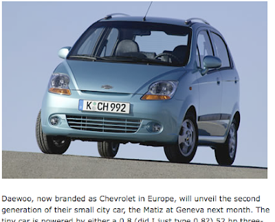
In the talk he also quotes somebody saying that "advertising is the prize companies pay for being unoriginal". And though I don't entirely agree with this quote, there is some truth in it. With functionality becoming increasingly similar between products, brand personality is what sets products appart, and design plays a very important role in the building of this brand personality. Imagine for a second two different computers looking exactly the same, but with different brand names on them. It feels cheap and fake. Chevrolet and Daewoo selling the same car with different names on them is a real life example of this.
An example of the opposite is boat outboard engine brands Mercury and Mariner. Two identical products sporting different design and communication, and consequently attract two different target groups.


Another good example of this is Coke Light and Coke Zero. I don't have to show you this one, but they've done incredible work in making the feminine Coke Light macho.
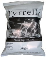
Yet another example that I use a lot to explain how advertising and design should be idea driven and work together is that of naked chips. An ordinary approach for a design agency when presented with the brief to create packaging for the product "chips without salt" would be to take the usual bag, type "no salt chips" on it and make it a different color. Maybe light blue. When giving this product to the advertising agency, they can end up doing anything, because there is no idea in the new packaging at all. Another design and branding approach would be to put a bunch of naked people on the bag and call it "Naked Chips". Leave this new design to the same advertising agency, and you'll probably end up with some amazing campaign ideas. Naked chips is a real life example of design found in a London grocery store.
My final example of branding and design driven campaigns is Diamond Shreddies, a Clio winner campaign that was much talked about this year in Cannes. This link will take you to the You Tube search page for Diamond Shreddies. See if you can figure out what's going on.
My point here is that strong branding and design should be at the core of any communications effort. Like I said – watch the Yves Behar talk below and be inspired. When watching the talk, take special note of the "Why Water" case, and consider if good communication could be made out of this design concept. Myself, I got about ten different ideas instantly.
In the talk he also quotes somebody saying that "advertising is the prize companies pay for being unoriginal". And though I don't entirely agree with this quote, there is some truth in it. With functionality becoming increasingly similar between products, brand personality is what sets products appart, and design plays a very important role in the building of this brand personality. Imagine for a second two different computers looking exactly the same, but with different brand names on them. It feels cheap and fake. Chevrolet and Daewoo selling the same car with different names on them is a real life example of this.

An example of the opposite is boat outboard engine brands Mercury and Mariner. Two identical products sporting different design and communication, and consequently attract two different target groups.


Another good example of this is Coke Light and Coke Zero. I don't have to show you this one, but they've done incredible work in making the feminine Coke Light macho.
Yet another example that I use a lot to explain how advertising and design should be idea driven and work together is that of naked chips. An ordinary approach for a design agency when presented with the brief to create packaging for the product "chips without salt" would be to take the usual bag, type "no salt chips" on it and make it a different color. Maybe light blue. When giving this product to the advertising agency, they can end up doing anything, because there is no idea in the new packaging at all. Another design and branding approach would be to put a bunch of naked people on the bag and call it "Naked Chips". Leave this new design to the same advertising agency, and you'll probably end up with some amazing campaign ideas. Naked chips is a real life example of design found in a London grocery store.

My final example of branding and design driven campaigns is Diamond Shreddies, a Clio winner campaign that was much talked about this year in Cannes. This link will take you to the You Tube search page for Diamond Shreddies. See if you can figure out what's going on.
My point here is that strong branding and design should be at the core of any communications effort. Like I said – watch the Yves Behar talk below and be inspired. When watching the talk, take special note of the "Why Water" case, and consider if good communication could be made out of this design concept. Myself, I got about ten different ideas instantly.
Prenumerera på:
Inlägg (Atom)