Being a crazy American, Halloween is really engrained into my being. I was raised in the tradition of dressing up in horrifying costumes every year and trick-or-treating around the neighborhood of central Ohio. Being a horror film lover and enjoying the creepy feeling of being frightened senseless, this was one of the absolute best days of the year. Back then, we could actually trick-or-treat at night when it was pitch black outside, and I can't imagine it any other way (today, the fun ends when it becomes dark). As a matter of fact, I was so affected by the planning and suspense of halloween that I dream about trick-or-treating about once a month! (Just call me a nerd.)
Every year I dumped my enormous bag of candy on the living room floor and analysed all of the varieties, grouping them into categories of best brands and worse/no-name brands (these were the ones that mom got if she asked for me to share with her ; ). Of course one remembers the house that generously gives out the best bars, and blacklists the homes that dared to give you the cheapest of the cheap, without chocolate contents and without a proper wrapper that invested in appropriate Halloween attire. This was very important to complete the ring of scary experiences!
Yes, in the United States basically every edible, sweet brand re-clothes its packaging during this time of year. Of course you expect American confectionary brands to go the halloween route, but did you know that even crackers, ice cream, potato chips, cereals, and beverages also make the spooky change?
From a European design and branding standpoint, the thought of a Halloween-themed attire probably sounds very tacky and tasteless. But I, American, really wanted to dig a bit deeper in this area. Are there tasteful AND non-tacky applications for this holiday? The answer is...NO! One of the two parameters seems to be a requisite. But, hey, with Halloween comes the possibility to explore your tacky inner self, to break away from the clean and streamlined sophistication we try to surround ourselves with daily. Let yourself go!
With that, let me present my few findings. First up are my 4 best packaging finds, before moving on to 4 best product finds.
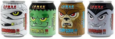
Halloween packaging aesthetic #1: Jones Soda - A creepy treat by the folks at Jones
I adore these cans of soda! Humorous design and fun flavour names like Buried Pomegranate, Lemon Drop Dead, Spooookiwi, Candy Corn, Blood Orange and Dread Apple) make me howl!
www.jonessoda.com
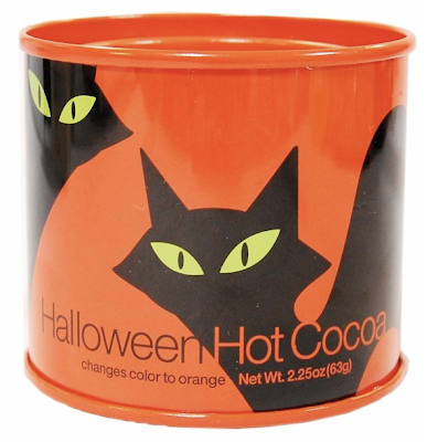
Halloween packaging aesthetic #2: Crate & Barrel Halloween cocoa
Crate & Barrel's attractive can with two servings of cocoa powder mystically turns orange when mixing with milk. This is on my aesthetic list, although not a huge ball of fun.
www.crateandbarrel.com/family
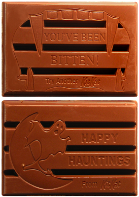
 Halloween packaging aesthetic #3: Kit Kat Ghoulish Collection
This is a finely executed package for a major brand which changes disguise in the good spirit of halloween. I love the vampire sinking his teeth around the logotype (he seems to be biting very gently, as if holding a delicate egg in his mouth, in respect of the Kit Kat brand's free space!), as well as the relatively clean look. Kit Kat is one of the bars that I sorted into the 'best' pile when I was young, but with text and images now on the chocolate bar itself, Kit Kat's trick-or-treat version ends up in a brand-name category by itself.

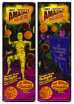
 Halloween packaging aesthetic #4: Joby & Marty's Amazing All Natural Chocolate
Talk about kitch! Joby & Marty's is a leader in kitchy (read: tacky) holiday-inspired packages that just wanna have fun. With this bar in hand, you may just as well admit that you believe in UFOs and dream of quitting your job to run a comic book store.
www.jobyandmartys.com
 Is it worth the investment for a new halloween package design, production, and distribution for such a short timeframe? When it comes to major candy brands in the US, kids will never forget the brands that made the effort to impress them with their halloween humor. And with halloween being the leading candy holiday (with sales of $2.1 billion dollars in 2005, according to Bankrate.com, http://www.bankrate.com/brm/news/biz/thumb/20011024a.asp), that memory will turn out to be very important during an individual's lifetime.
Now let's take a step away from packaging. Being a halloween fanatic who has served jello formed in a brain mold to my guests, I was just 'dying' to find if there were any non-food spooky products that could be considered aesthetic. Here are my four best:
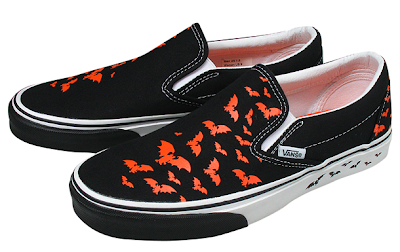
Halloween product aesthetic #1: Vans 'Bat Trails'
The classic slip-on has never been afraid of expressing its feelings. Here in a new halloween design called 'Bat Trails'.
www.shop.vans.com
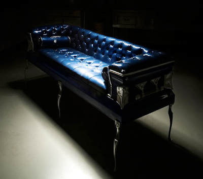
 Halloween product aesthetic #2: Coffin Couches' eco-friendly coffin sofa
We at Identity Works stand for eco-friendly products....and here we have a truly unusual peice! The company Coffin Couches produces sofas made of recycled coffins. The coffins have been used once for showings and may have had minor nicks in the finish, but have never been underground, obviously! Rather than letting the costly and luxurious boxes end up in a landfill, the company came up with the idea of making furniture. Gotta love it!
http://coffincouches.com/
Halloween product aesthetic #3: Marc Jacobs Sidney timepiece
It's true, Marc Jacobs stands behind this watch, perfect for this time of year.
Sidney # MBM 5016
www.marcjacobs.com
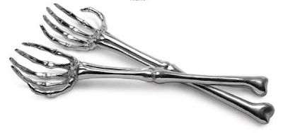
 Halloween product aesthetic #4: Skeleton hand salad spoons
These boney utensils help you 'sink your teeth into' a good salad.
www.whatonearthcatalog.com
Please don't hesitate if you are able to challenge these packaging or product best-ofs! And don't forget, the frightful day comes and goes quickly, so enjoy it while you can, kids!
Article by Gail Baker

