torsdag 28 augusti 2008

The Beautiful Fashion Tale Magazine


I really like the new Fashion Tale Magazine. Beautiful photography, interesting models, superb fashion sense all around.

They also have the entire thing on the web for your browsing pleasure.

Beautiful work, and hats of to Creative Director Carl Wahlström and Art Director Hanna Hedman. (I capitalized their titles on purpose).


måndag 25 augusti 2008

Might As Well Have The Best

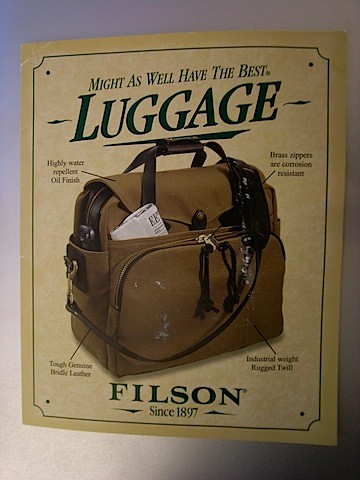
Besides the fact that I absolutely adore the legendary (and expensive) bags from Filson, they also have less than humble tagline. "Might As Well Have The Best". I kind of like it actually.


R0015622.JPG


But it's also one of those taglines that you HAVE to back up in your product. Unless you really ARE the best, having a tagline like that is just counter-productive. After having owned a 266 "Sportsman's Bag" for a while know, I can promise you that it does live up to it's tagline.

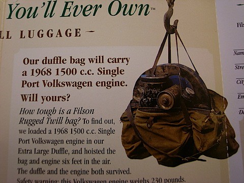
They also have an interesting piece of "proof" on their warranty slip.


R0015625.JPG


Classic and interesting brand.

tisdag 19 augusti 2008

Chief Innovation Officer Anna Sävenstedt To Aftonbladet

Organization of creativity and innovation is one of my favorite topics. I haven't written about it much here, but I actually wrote my masters thesis on the subject for my M.Sc. in Media Technology back in 2003.

More advanced organizational principles and technological aids for innovation are rare in the media industry, at least in Sweden. It's not easy to get these things to work, so I really can't blame anybody, but still I believe there should be more attempts made. If successfully inlemented it could be massively profitable.

Today I found out that Aftonbladet are actually instituting an innovation officer to work on these things, with the ambition to activate the most innovation capacity from the entire organization. Her name is Agnes Sävenstedt, and interestingly enough, she also has an M.Sc. in Media Technology. I guess we just like innovation.

Anyway, it's an interesting move from Aftonbladet, who I think are big enough to make something like this work.

Read more about it here.

lördag 16 augusti 2008

Household Trash

Swedish designer Jantze Brogård Asshoff has dreamt up this amazing looking trash can. I WANT ONE FOR MY KITCHEN!

Unfortunately it's not in production yet, so keep your fingers crossed.

(Read more about it here).


måndag 11 augusti 2008

Cycle in Style With These Fine Helmets

So, you want to swoosh down the street in style, but you don't want to crack your skull open in case of a crash – what to do?

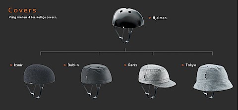
Well, the Danish (who else...) solved the problem. With protective helmets disguised as stylish hats, Yakkay might well be a smash hit in style-conscious communities across the globe. Just look at these beauties:

Bild 19.png

The Meaning Is The Message, Or Is It?

A few Swedish blogs (here they are 1, 2, 3) have spent some time discussing if advertising needs a message. I believe it was all sparked by this article by Paul Feldwick.

For those of you who can't read Swedish (don't worry, we're only 9 million people), I can just quickly recap the discussion: They are discussing whether advertising should have a message, must have a message (since message is equal to meaning), or shouldn't have a message but rather a topic to sparc discussion. (Sorry 1, 2, 3 for the simplification).

I'm not so sure about defining message as being the same thing as meaning. A message is the code being sent, while meaning is the interpretation of the code. And that interpretation is dependent on many factors. I do agree on, on the other hand, that there needs to be some sort of message from someone (not necessarily the advertiser) in order for someone on the recieving end to have something to interpret, and thus make meaning out of.

First of all I would like to say that meaning doesn't have to be rational. It never is entirely, and most of the time it's predominatly emotional. For the most part we interpret with our emotions and try to explain our interpretations rationally. And that I think is one of the main points of Mr Feldwick's. So messages are most of the time interpreted into meaning without us ever knowing.

So what about messages? That's a little more complicated. A message is carried from point A to point B (where B can be anything from one person to several million). But it can also be forwarded on to C, D, and onwards (C and D can also be huge numbers). The can be distorted along the way, and will almost certainly be interpreted differently. Rational messages will be easy to interpret rationally, but will a lot of times lead to less stimulating emotional responses. Emotional and irrational messages can, if they are good, create a much stronger emotional response, a much wider spread (B, C, D, and onwards), and be more effective in attaching emotional values to the brand. But they require more talent (or luck) to create and a lot of trust from the client (I can only imagine the initial client response to the Cadbury's gorilla).

So to answer the question if advertising needs a message, I would say yes. All communication does. But it doesn't have to be a rational message, and the sender may be aware that there are many possible interpretations. In that case it's similar to art or poetry really. And advertising agencies would never claim to be in the business of art or poetry (besides the thursday night art club). But "branded content" is the hottest thing there is right now. I see paradox here.

My conclusion then:
Don't assume that messages and meanings interpreted out of those messages have to be rational. Meanings never are anyway, and succesful messages rarely are. And that's why succesful advertising agencies need talent. Emotional and artistic talent.

torsdag 7 augusti 2008

Digital Design Is Still a Child

Humanity has been pretty good at graphic design for quite some time now (though we may have called it something else early on). The same goes for packaging design. Sure there have been plenty of innovations along the way such as the printing press, photography and modern day packaging technology, but still.

I guess you could say that interaction design was born at the same time as the first stick n' stone tools, but more systematic and advanced interaction design can perhaps be considered approximately as old as the industrial revolution.

Digital interaction design, meaning design for interacting with computers, is young. DID aimed at the general public, is really young. Born by Xerox Parc and Apple (and copied by Microsoft), the window-based interaction model still prevails.

But being this young, I think we've only seen the first beginnings of a huge market for digital design (including DID). The move towards digital media is natural and inevitable, and we're still stuck i a design world that is very static. We're moving towards a "one machine"-world, where we'll interact with data in different ways, not neccessarily web pages. RSS-readers is an early example of this.

The more basic question of how to interact with data through a "browser" is one that many are trying to answer. Not least the people of Mozilla labs. They have suggested a model for a future browser that looks like this (corny film, but you'll get the point):


Aurora (Part 1) from Adaptive Path on Vimeo.

Can you imagine your grandmother trying to work this interface? Neither can I. I think that they have made the classic mistake of being too complicated and too techy. But that might just be me.

But if you spot a good digital design agency with razor sharp DID-skills, give me a call. I want to buy some stock and get rich.

måndag 4 augusti 2008

Design Talks: Supercars of the late 60's

On my new little section "Design Talks" I'll look at some design case studies that interest me. First out is the supercars of the late 60's and early 70's. They are interesting for several reasons. The designs have sprung from technical innovations like the mid-engine layout, but are also politically inspired by the space age race to the moon. Lines are simple technical and clean resembling the architecture and interior design of the late 90's or perhaps modern day highly designed tools. Only, it's the other way around.

With the innovation of the mid-engine layout and with space age inspiration, the 60's gave birth to the first incarnation of the supercar. This concept would keep on evolving until mid 70's where the oil crisis and an economic downward spiral put an end to the futuristic supercar dreams.

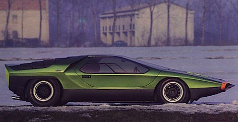
Besides improving car handling, the mid-engine layout enabled designers to integrate the angle of the shorter bonnet with the windshield, effectively creating a bulletlike profile. The 1968 Alfa Romeo Carabo, designed by Marcello Gandini is a nice example.

Supercars_Alfa_Romeo_Carabo_Thum.jpg

It's incredible to me how modern-looking some of these cars were. Look for example at this spaceship inspired 1970 Lancia Stratos:

Supercars_Lancia_Stratos_Thum.jpg

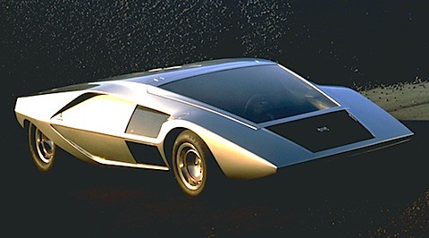
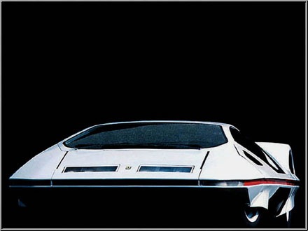
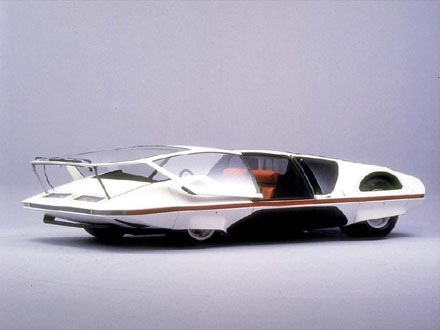
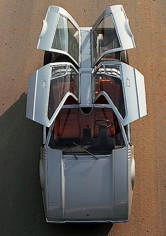
There were also more extreme concept cars. The 1970 Ferrari Modulos for example, that bent the rules and limits of the Ferrari brand. The concept picked up no less than 22 design awards worldwide.

Ferrari_Modulo_512s_1970_Thum.jpgConcept_Car_Ferrari_Modulo_1970_Thum.jpg


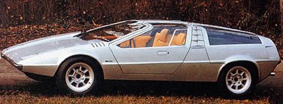
The 1970 Porsche Tapiro is another amazing car from Giorgetto Giugiaro of Ital Design.

Porsche_VW_Tapiro.jpg Porsche_Tapiro_Side.jpg


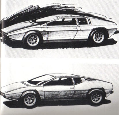
The Tapiro is also the forerunner and design inspiration of the legendary Lotus Esprit. Below are sketches for the Esprit, and you can clearly see the similarities to the Tapiro above.

Lotus_Esprit_Sketch_1972.jpg

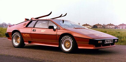
Introduced in 1972, the Esprit was the symbol of luxury and power in movies like Pretty Woman, Basic Instinct, For Your Eyes Only and The Spy Who Loved Me. Look at the skies on the roof. Got to love that.

Lotus_Turbo_Esprit_James_Bond_007_Thum.jpg

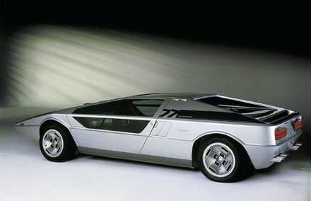
Shown at the same Ital Design show as the Esprit was also my favorite of them all – the 1972 Maserati Boomerang. Give me one of these, and I'll drive you anywhere. Look at the interior design of this thing!

Maserati_Boomerang_1972_Thum.jpg


With this little design talk I hope to inspire a little bit of courage. These cars were very extreme at the time of their conception. They still are today.

The design world needs courage and outrageousnes. It is what pushes the limits. I doubt that the highly succesful Lotus Esprit would have ever existed without its less famous predecessors. So keep moving, keep pushing the envelope and have fun. This is the only way to evolve.

Pictures and info from www.lotusespritturbo.com.

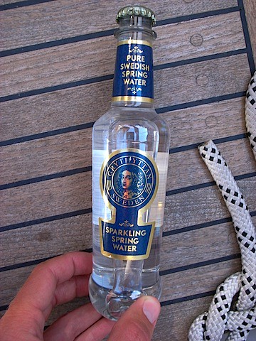
It looks like a million bucks

R0015040.JPG

At a deli in Sandhamn I stumbled upon this bottle of water. My initial impression was that this product must be expensive, but it turns out it isn't.

Emotionally, it feels wasteful to indulge in such expensive water, but rationally I know it isn't expensive at all. So what is going on here?

I think that this is a good example of pricing as part of the design. And it feels like there is confusion in the product strategy. I would love to get my hands on the strategy document for this product, and especially the positioning statement. What are they trying to be? If they want to be high end, the price should reflect that strategy, just as the design does. If they want to be mid price, the design should reflect that.

I still love the design though.